Wednesday, February 24, 2010

A Whole New World Girl


There's been an obscene lack of art on this blog lately, so I decided to post concepts from one of Anthem's past projects that fell through.  I don't exactly remember what happened. I think our client's price was too low for the amount of work that would have gone into it. This was a project from last year (around August maybe), so I'm not sure of whatever became of the client's project.

Our client was planning to create a line of dolls more, or less like American Girl. The franchise would be known as "World Girl."  Like the American Girl dolls, each would have its own back-story and customizable clothing. However, these dolls would do more than just look pretty. The whole shtick with World Girl was that the dolls would also teach another language. I'm sure there was also supposed to be some online interactive version of each character that had lessons to follow. A lot of the details have been lost in time. All the info I got was second hand.  I never spoke to the client directly, or ever saw her in person.

The prototype for their first doll was that of an impoverished orphan from whom you'd learn Spanish.  Our first roll was to take their concept art and jazz it up.


I'm probably not a liberty to post the original concept drawing they provided, but you can get an idea of what it looked like in the sketches below. I was under the impression that I was supposed to recreate the concept verbatim, just drawn better. So that's what I set out to do. I even translated the kinda awkward pose, except less awkward. Unlike the structure of that last sentence.


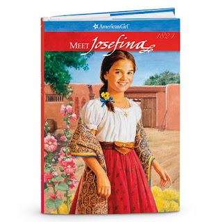
You'll see a few sketches I did from looking at one of American Girl's illustrations of Josefina. She's part of their historical line.


I may have done this before I started referencing Josefina.

I actually Frankenstien-ed this sketch from two separate ones. I didn't like the body in one sketch and the head in another, so...... FUUU-SION HA!

I didn't design that dress, btw. That's what she had one in the concept we were given.


Now I did design this one. I don't claim to know anything about fashion (especially for little girls), but I think that'd work for a doll.


We got some critiques from the client that she looked too "Black." I suppose I can see that now. Those lips are pretty full. She's also got some thick 90's eyebrows there.

I guess it's that ol' chestnut about artists putting themselves into their work. My characters tend to "look Black" in one way, or another.  People even claim that the turtle from my film makes expressions like me.  

At any rate, I had to darken her hair and lighten her skin to make her look more Hispanic.  I don't know how well that worked.  Black is a color of many shades.


Regardless of her true racial identity, they also wanted her to look cuter.


Went a bit more stylized, but that was apparently too much.


I already had an earlier sketch that was more cutesy, so I threw some color on it.


Oh, but it didn't end there.  The costume had to go. I then went to work on some alternate dresses.  Again, I used American Girl for reference, but also some traditional adornment from various latin cultures.


I think this was the dress I wound up going with. Out of all the designs, it wound have been the simplest to animate (for the interactive web stuff). I also had to strike a fine balance between poor and fashionable. I was told that she had to look like a doll a girl would want to buy, but not so glamorous that she looks rich. She was supposed to be an orphan after all.

Once again, there were issues with the hair. I had to make it straighter and turn down the lightness even more.

The project went bust soon after. I did get a lot of art out of though.  If anything, I'll say that this was an interesting character design exercise.

Saturday, February 6, 2010

Bend It like Bevil

I don't know why, but absolutely love to sketch unsavory, deranged, and downright repugnant characters. It's so fun to draw a bunch of freaks and monsters. I suppose just general weirdness facinates me.

A love of the darker, dirtier, more unshaven side of the human existence is not something I alone harbor. There are colleges of mine whom enjoy a good stroll through the realms of madmen as much as I do. Case in point, the author of the web comic "Get Bent."

Get Bent chronicles the disfunction of Carl Bent and his son Chuck.


I love how downright despicable the son looks at times. Some of his expressions kinda look like something from Flapjack.


The artist's website can be viewed here.

Sunday, January 24, 2010

Do the Part-Time Shuffle!

I remember a time when I would walk into a comic shop and be in awe at the gross abundance fun and interesting books laid out before me. The experience was akin to walking into a Toys R Us, except without those sliding doors that blast you with plastic-scented air conditioning. That would have been ever better. Never-the-less, going to check out the latest comics was something I'd look always forward to. As the years have gone by, I become less and less driven to hit up many comic stores (except for the ones that sell old comics). Most people would probably equate that with getting older, but not in my case. To put it simply....

They just don't make 'em like they used to anymore.

Don't get me wrong. There are a few gems to be found here and there, but they're much fewer and farther between than they used to be. I'm now pretty reliant on the internet, or friend recommendations to lead me to the good stuff. In this case, a promising new comic comes from a fellow graduate of Savannah College of Art and Design.


Story and Lineart by James Stanley
Coloring by Jessie Lam


(I half-expect to see a boss fight with the bartender in an alley.)


The image above was enough to hook me in.  The presenation has the same vibe I'd get from a fighting game, or a side-scrolling beat 'em up. As a huge fan of those things, that's definitely a plus. The entertainment value of such resonates not just through the art, but also in the story.

Part-Time shuffle is the chronicles the exploits of Meiko Schultz, a half Japanese-half Jewish, Osaka resident with hopes of becoming a famous film directer. Until her dreams take off, she humbly runs a family-owned video/hobby shop called "Hole in the Wall".  With childhood friends Shunya and Aoi helping out, things are going pretty well.  Little does Meiko know about her family's "other" business.

She's told the full scope of what she's truly inherited by the notorious Kigen Yakuza. Feeling cornered, if not confused, Meiko offers her services to the family.  Surprisingly, her offer is accepted and Meiko becomes the family's new part-time assassin.

In the preview currently online, you get a taste of what to expect from the series. There's a great sense of humor already present as we are introduced to the main characters. Readers will also be treated by colorful writing such as "butthurt{ness}" and "unfortunate slumber is happen..."

The art is clean, solid, visually engaging. The designs give you just enough information to establish each character's idiosyncrasy without piling on too many accessories. Many designers have a tendency to get detail-happy, witch actually winds up making the characters look less distinct. Such is not the case here.

So far, this comic looks to be one of the coveted gems of today.  Light-hearted action/adventures have always been favorites of mine, so I hope to see more of the series.


The online preview is currently available on the artist's website.

Friday, January 1, 2010

Rusty Sketchin'


Well, I wanted to kick off the year of the tiger with some Sagat fanart.


It's been a while since I've sat down to do a finished graphite drawing, so it's no surprise that this one didn't turn out quite like I wanted.  The musculature looks like mush. The biggest fowl up was on the arms, which is why I cropped them out.

This is definitely something I gotta polish in photoshop.

Just for the hell of it. Here're the drafts. Maybe I'll post the whole slew of sketches I did before even these.


Scanner wasn't big enough to get the whole thing.

Thursday, December 24, 2009

An Anthem Christmas

Here's a Christmas card I made for Anthem Creative Groups. The cards themselves have Anthem's logo on the bottom right.


When asked to sketch ideas for the card, I speculated as to what kind of character would be the most fun to draw.  A snowman was the first thing that came to mind since, they don't really have a "standard look".  Their facial features, limbs, and adornments can be made out of anything. Eyes can be coal, buttons (as shown above), simple indentations in the snow, or just anything remotely round.

Like scarecrows, you can pretty much just dress them anyway you want. Since most people would use old, worn out clothes for that sort of thing, snowmen and scarecrows tend to look a bit like hoboes. I think what I was going for was a "charming English tramp" sort of thing. Dickens-esque, if you will.

As for the concept, I just sketched out the first humorous situation involving a snowman that came to mind.


"A Snowman roasting a marshmallow with a really long stick."


If figured that it'd be something people would find cute and amusing. Something they'd look at and go....


"Hey, well alright. Looks like the snowman's roasting himself up a marshmallow there. Ha haaa, but he's got that long stick cause he doesn't wanna melt. Ha ha ha! How 'bout that? "


It's funny, A lot of my coworkers the interpreted the situation as being very grim. The more I thought about what I drew, the more I started to see it myself.


"A Snowman with wooden arms, sitting on a dry log, in front of a dry tree, holding a branch amidst a roaring fire."


One begs the question. Is he greeting hello, or bidding farewell?

In any case, he can't even eat that marshmallow. What's going to do with it? Even if he had to bodily means to swallow it, it would melt his insides.

Maybe it's like the elephant man. He knows that sleeping on his back with his head flat will kill him, but he just wants to sleep like a normal person. Perhaps the snowman wants to experience his first and last moment of normalcy (normalcy in terms of what "real" people can do). He has the long stick not to avoid the fire, but to savor the experience longer before the fire reaches him.

I often wonder if I'm incapable of creating something without morose undertones.

Tuesday, December 22, 2009

Aztecs Revised: Part 2

This round, I focused on making the lead lizard-man stand out a bit more.  At the very least, I wanted to continue experimenting with the coloring throughout the page.


In the first panel, I added some of the ground color to his back and added some reflected light to his arm. In the second and third panels, I covered him with some of the sky color. Even then, I feel like the lizard-man with the "hook/sickle"-like weapon wound up taking over the third panel.  It's mostly because I made the cave area darker. That's the exact opposite of what I wanted to do. All the lizard-men kinda pop better now, but I think I like the bright red dirt in the old version better.

As if I wasn't indecisive enough, THIS happened when I was messing around with layering effects.


I really like the contrast going on there, but I can't figure out how to replicate it without the green (which helps give it that glow). It has such a soft painterly look to it. Maybe I can keep some green around their bodies and blacken out the cast shadows. If I brought back the redness in the soil, that would compliment the green.

Hmmm. I don't know what I'll do.


Now, here I pretty much did what I said I was in the previous Aztec post. I brought a  little yellow back to the lizard-men in the second panel, added some value to the third panel, a gradient to the fourth. I decided to throw in that same gradient color to the first panel to tie the whole thing together. A big change I made was brightening up the glow in the second panel. I'm still iffy about that decision. I don't want the values to get too overbearing.  I'll keep playing around with everything and see where it goes.