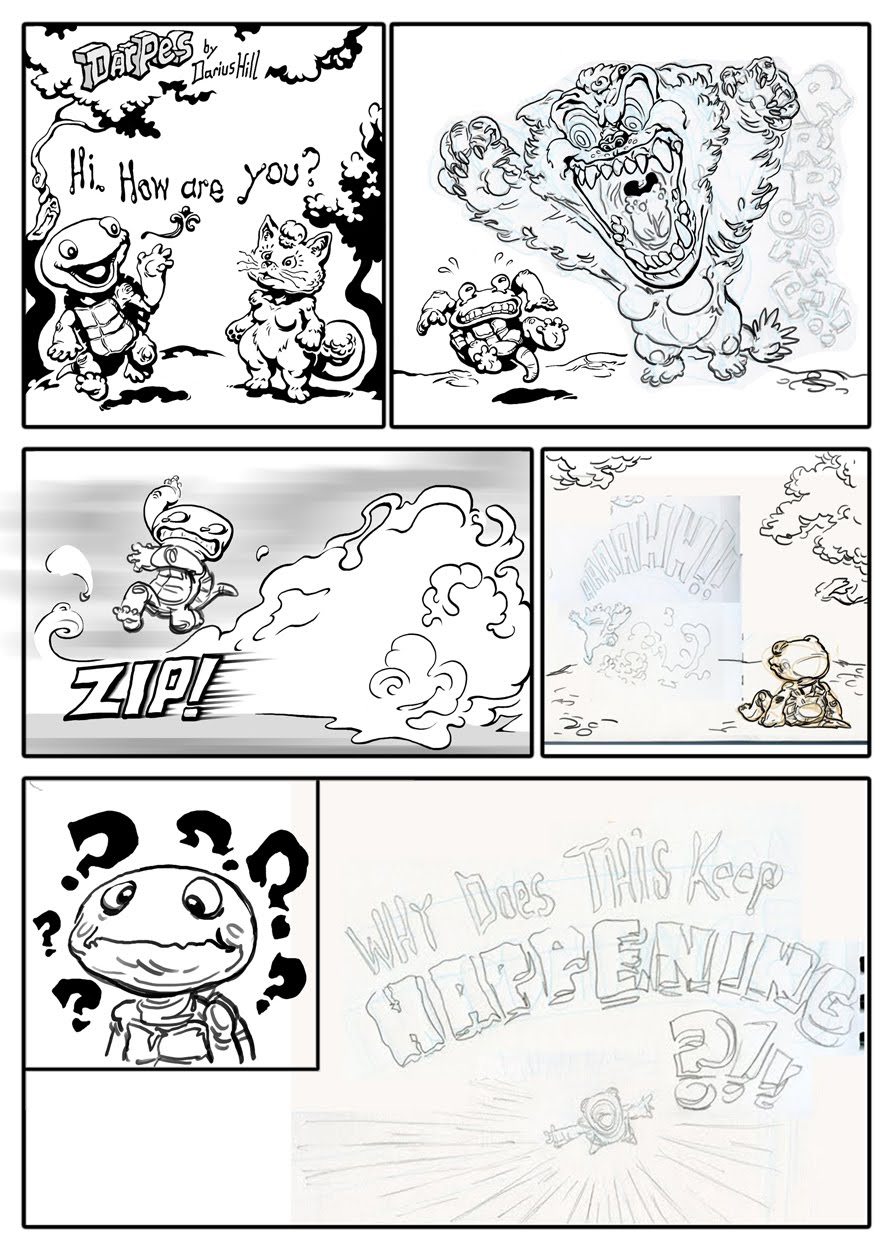
New concept, developed for an art test. I'll cover the process (about a week in duration) in a follow-up post.
Showing posts with label Inking. Show all posts
Tuesday, August 13, 2013
Tuesday, November 29, 2011
Sonic CD Fanart Contest
You're seeing it here first!
Just finished pulling an all-nighter to pump this out. I heard about the contest relatively late (only a week, or so 'til the deadline), so I had to hustle. Fortunately I'd done quite a bit of work to it over the weekend, so I wasn't working from scratch. Still, it took almost 12 hours to finish.
The absolute final deadline was 10:00am this morning. I got it in just in the nick of time, around 9:30.
*Update* 1-2-12
I was chosen as one of the first-prize winners! See my entry among the rest on Sega's Flickr.
*Update* 1-2-12
I was chosen as one of the first-prize winners! See my entry among the rest on Sega's Flickr.
Saturday, October 8, 2011
Hot off the presses!
As of now, I'm officially a published illustrator! I was recently contracted to to do over a dozen illustrations for a children's book called "The Elf Bully." The original title was "Getting Santa's elf on the Shelf." That, of course, had to be changed to avoid association with "Elf on a Shelf." That also called for a new cover to replace the one below.
Relatively speaking, it was a quick project. Initially scheduled for 2 weeks, it wound up taking about 4. The time-frame was actually rather appropriate since the project essentially paid my rent. hehe
Tuesday, June 21, 2011
Dragons' Duel
I got another dinosaur for you, or should I say dragon? ;)
Most, if not all, of my next postings will be of old stuff. I've been too busy with freelance and other things to work much on new stuff (or finish in-progress pieces.)
This is an ink drawing from college. Based upon the dates written on the back, I seem to have worked on this off and on for six days.
Most, if not all, of my next postings will be of old stuff. I've been too busy with freelance and other things to work much on new stuff (or finish in-progress pieces.)
7-12-05
7-13-05
7-17-05
7-19-05
8-7-05
8-12-05
Wednesday, August 11, 2010
Sudden Scribbles, Solidification Pt. 4
I stole a couple of hours tonight to work on this. Out of all the outside work I've been doing, I figure I should take SOME time to work on personal stuff. Tonight I got panel 2 a little closer to completion.
Tuesday, July 6, 2010
Scratches in the Dark
Sunday, May 30, 2010
Thursday, April 22, 2010
Wednesday, April 7, 2010
Friday, November 6, 2009
To Kill A Bluebird...
As was mentioned in an earlier post, this is a piece called " No Toys For Men" done for "Break" the Anthology. It's due to be released some time before Christmas, but there's currently no definitive date. Since it actually IS coming out, I supposed I shouldn't be posting this. Ehhh, oh well.
The theme of the anthology is, of course, centered around the concept of "breaking." For quite some time, I was at a lost as to what I should do. The obvious thing to do would have been to draw some character breaking through something, or to conceptualize a broken heart. I wanted to be a bit more clever than that, so I made a list of every concept, scenario, and phrase related to breaking as possible. The list ranged from the abstract (broken spirit), to the physical (broken neck). It soon dawned on me that a combination of both tangible and intangible forms of breaking would yield the most interesting result.
The intangible aspect of it would be the most important, so I began my exploration there. Emotional, psychological, or spiritual anguish were always favorite subjects of mine. Whatever I did would most likely represent one of those three states. I eventually found myself wanting to deal with the establishment and subsequent destruction of happiness.
That process potentially covers many forms of breaking: A breaking of ones dreams, perceptions, and concepts of reality. It is disillusionment, pure and absolute. To fully embody it, I needed a powerful symbol of happiness.
The most iconic and profound symbol of happiness is, of course, the bluebird.

The bluebird of happiness is an enduring symbol of joyous, childlike, innocence. Inversely, the death of a bluebird represents disenchantment and a transition into adulthood. It was then that it became evident to me that my primary visual cue should be not just a bluebird, but a bluebird ravaged and in ruin.
In my research of bluebirds, I ran across a species of bluebird known as the Fairy-Bluebird.
As brilliant as its blue plumage is, I didn't want to use the male of the species as a source of imagery. Luckily, the female of the species was pretty colorful as well (as opposed to most bird species).


Ah, but I digress. The Fairy with Turquoise Hair, in her original book incarnation, is a motherly figure that helps Pinocchio mature and earn his humanity through good will. Her role in Pinocchio's transformation is a bit more direct outside of the book. The Disney "Blue Fairy" not only granted Pinocchio's wish to be a real boy, but was also the one who brought him to life in the first place. That was a granting of Gepetto's wish upon a star. Through and through, she was a benevolent being of wish fulfillment. Wish fulfillment is the divine-like realization of a dream and the promise of happiness.
Pinocchio also lead to the idea of including a boy in the illustration. Through the destruction of the bluebird, the boy would be changed, or transformed in some manner. I then asked myself, "What should his relationship with the bird be?". Was it a pet? Was it some sort of gift, or did he capture it himself?
Or,........perhaps he made it. Yes, the meticulous building of a dream. Forging one's own reality, piece by piece. Creating a vessel to take one far into the heavens where dreams reign supreme and each star is a covenant that righteous aspirations are rewarded. The sun, being the greatest of which.
To best illustrate to idea of constructing happiness, I thought it'd be appropriate that the bird be artificial, a toy even. A boy who built his own toy bird. However, the bird would have to be more than a toy. An embodiment of childish idealism would have to be a guardian of sorts. Something massive. Hence, a giant mechanical bird.
.jpg)


The boy has inadvertently crashed it and in doing so jolted himeslf out of his idealistic bubble.


I thought nothing of it at first, but after closer examination, I thought to myself about the importance of his adulthood being represented a shadow. Who he is on the inside has been changed forever, but he's still a child. His transformation into adulthood may just be a superficial facade. A person caught between two states of being. More than a child, but less than a man. He's left to wander the grey wilderness, searching for meaning. Searching for something to believe in again.
I that doubt much of that will be very apparent to anyone who sees this in publication. At the very least, it was a cathartic experience for me. It commemorates a milestone in my life that I will touch upon in full on Monday Nov. 30th. The 1 year anniversary of my bluebird's death.
The theme of the anthology is, of course, centered around the concept of "breaking." For quite some time, I was at a lost as to what I should do. The obvious thing to do would have been to draw some character breaking through something, or to conceptualize a broken heart. I wanted to be a bit more clever than that, so I made a list of every concept, scenario, and phrase related to breaking as possible. The list ranged from the abstract (broken spirit), to the physical (broken neck). It soon dawned on me that a combination of both tangible and intangible forms of breaking would yield the most interesting result.
The intangible aspect of it would be the most important, so I began my exploration there. Emotional, psychological, or spiritual anguish were always favorite subjects of mine. Whatever I did would most likely represent one of those three states. I eventually found myself wanting to deal with the establishment and subsequent destruction of happiness.
That process potentially covers many forms of breaking: A breaking of ones dreams, perceptions, and concepts of reality. It is disillusionment, pure and absolute. To fully embody it, I needed a powerful symbol of happiness.
The most iconic and profound symbol of happiness is, of course, the bluebird.

The bluebird of happiness is an enduring symbol of joyous, childlike, innocence. Inversely, the death of a bluebird represents disenchantment and a transition into adulthood. It was then that it became evident to me that my primary visual cue should be not just a bluebird, but a bluebird ravaged and in ruin.
In my research of bluebirds, I ran across a species of bluebird known as the Fairy-Bluebird.
As brilliant as its blue plumage is, I didn't want to use the male of the species as a source of imagery. Luckily, the female of the species was pretty colorful as well (as opposed to most bird species).
This was actually a turn for the better. It's appropriate that the blue coloration of the females is more turquoise in hue, because the name "Fairy-Bluebird" reminded me of "The Fairy with the Turquoise Hair." from "The Adventures of Pinocchio."
She's more commonly known as the "Blue Fairy."

In the feature "Un burattino di nome Pinocchio" , her hair is blue, but not really turquoise.
Ah, but I digress. The Fairy with Turquoise Hair, in her original book incarnation, is a motherly figure that helps Pinocchio mature and earn his humanity through good will. Her role in Pinocchio's transformation is a bit more direct outside of the book. The Disney "Blue Fairy" not only granted Pinocchio's wish to be a real boy, but was also the one who brought him to life in the first place. That was a granting of Gepetto's wish upon a star. Through and through, she was a benevolent being of wish fulfillment. Wish fulfillment is the divine-like realization of a dream and the promise of happiness.
Pinocchio also lead to the idea of including a boy in the illustration. Through the destruction of the bluebird, the boy would be changed, or transformed in some manner. I then asked myself, "What should his relationship with the bird be?". Was it a pet? Was it some sort of gift, or did he capture it himself?
Or,........perhaps he made it. Yes, the meticulous building of a dream. Forging one's own reality, piece by piece. Creating a vessel to take one far into the heavens where dreams reign supreme and each star is a covenant that righteous aspirations are rewarded. The sun, being the greatest of which.
To best illustrate to idea of constructing happiness, I thought it'd be appropriate that the bird be artificial, a toy even. A boy who built his own toy bird. However, the bird would have to be more than a toy. An embodiment of childish idealism would have to be a guardian of sorts. Something massive. Hence, a giant mechanical bird.
.jpg)
I wanted the design of the bird-mech to be primarily reminiscent of those little wind-up tin toys. If possible, also I wanted to harken back to classic imagery of clockwork birds like the one in "The Nightingale."


For that reason, I made most of it very rounded and smooth with some "clockwork" accents here and there. You'll also notice the placement of the boy near the opening between the birds legs. Obviously it's to symbolize rebirth, but it also makes a nice focal point.

Here I altered the design of the bird-mech to match actual bird anatomy (namely the wings and legs). At the same time, I tried to retain the "tin toy" look. I also changed the boy's expression to that of shame rather then distress. I wanted to get across the idea that he was responsible for the bird's demise. To really drive it home, as well as to sell the whole "vessel/vehicle" aspect of it, I added a cockpit to the bird's head.


The boy has inadvertently crashed it and in doing so jolted himeslf out of his idealistic bubble.


The bird's wing blocks out the sun he cherished so much. Only the light of his new found perspective shall guide him.

I left an opening in the bird's neck for aesthetic and lighting purposes, but also to subtlety play around with the nature of the light source. It's obviously meant to be coming from within the bird, but you may also interpret it as sunlight passing through the bird. In that case, the artificial light of his bird-mech is really the light of his beloved sun.
In Native American culture, bluebirds are messengers of the sun who herald the dawn of a new day. The bluebird in this context could be not just a representative, but a messenger of the boy's own happiness. The bird-mech may have actually destroyed itself. It knew that its prolonged existence would hinder the boy's development. The boy had to be brought down to earth and be reborn as a man. This is represented by the tall shadow he's casting.


I thought nothing of it at first, but after closer examination, I thought to myself about the importance of his adulthood being represented a shadow. Who he is on the inside has been changed forever, but he's still a child. His transformation into adulthood may just be a superficial facade. A person caught between two states of being. More than a child, but less than a man. He's left to wander the grey wilderness, searching for meaning. Searching for something to believe in again.
I that doubt much of that will be very apparent to anyone who sees this in publication. At the very least, it was a cathartic experience for me. It commemorates a milestone in my life that I will touch upon in full on Monday Nov. 30th. The 1 year anniversary of my bluebird's death.
Tuesday, November 3, 2009
Shattered Wings of Blue
Here again we have a piece that was finished quite some time ago, but has only now shown itself on this blog. There are actually a lot more like it. For example, I have a whole slew of concept art I did for a company project that fell through. Look for that soon.
What we have here is an illustration done for anthology known as "Break." It was put together by some college colleagues, but it hasn't come yet. I'm not sure if it ever will, so I decided to go ahead and post my entry here. I may do another step by step walkthrough for this in another post. I'll also elaborate on the story behind the piece's abstract concept.
Also, I'll post bigger versions of these pix.
The piece is called "No Toys for Men."

Black and White (interior art) version
Monday, August 17, 2009
Monster Monday cont.....
Friday, July 24, 2009
Saturday, June 6, 2009
Aztec Comic Page 2
I started blocking in some colors and values for the 2nd page. I was going to wait until I'd done some values for the bottom panels, but I went ahead with the post anyway. I'm considering leaving the bottom left panel flat with very minimal values. Most of the page is already so dark so dark.
As you can see, I now have a logo in place for Empty Jar. It's kinda of a prototype, but It'll do for now.

As you can see, I now have a logo in place for Empty Jar. It's kinda of a prototype, but It'll do for now.

Saturday, May 30, 2009
Proposal Illustrations
Not long ago, Anthem sent out some proposals to Ignition Entertainment to do the websites for the upcoming games Muramasa: The Demon Blade and BlazBlue. With each proposal we sent out, we included an illustration to kinda jazz up the package.
I did this first image for Muramasa and the last two for Blazblue. I'd intentionallly done this sketch for a bi-weekly office drawing challenge.


The colored version is the one we sent out.
I did this first image for Muramasa and the last two for Blazblue. I'd intentionallly done this sketch for a bi-weekly office drawing challenge.


The colored version is the one we sent out.
Tuesday, May 19, 2009
Moar Comic Coloring
Tuesday, May 5, 2009
3rd Guard Doc Pic
Monday, May 4, 2009
Aztec Pages
aHey, hey! I found the rest of the Aztec Pages! You know I spent a ridiculous amount of time looking for the files I had saved on disc before I finally remembered that I had them saved on gmail.
Derp.
Never-the-less, here's the pages. Depending upon how well my coloring venture goes on the first page, I'll do these next.
All those waves are from the tracing paper I inked these on. In retrospect I should have used vellum. Maybe I could find any. I don't remember. Perhaps I thought vellum was too opaque to see the pencils.
Saturday, May 2, 2009
Moar Guard Docs!
Oh Lawd! A post that's actually on time! New shtuff on Guard Doc.
In addition to the original logo,....
(http://burntmoth.blogspot.com/2009/02/grand-return-part-ii.html)
I have to complete four illustrations for the website. They have to be a series of pix involving elderly people enjoying an energetic and carefree lifestyle. Basically anything to take their mind off death. Each image will appear when upon entering the pages for search entire registry, search wills, search life insurance, and search advance healthcare directives.
This first one is for the wills page. Initially my plan was to do them in pencil first and touch them up in Photoshop, but I wound up doing so much Photoshop tinkering that I decided to do the rest all on the computer.

In the inked version, I had to change the dog's feet because they apparently looked too beast-like. I also needed to close the dog's eye's a bit more. I was told that the dog looked as if he where in the process of hauling the children away to the forest and eating them. I also had to make their grampa look a bit less creepy.
For myself, I changed the girl's face a bit. I think it looks better, but even now I still think that the kids could be drawn cuter.
This was the first colored version. The pix are supposed to have kinda of a children's book feel. I try out using a limited color scheme and off-setting the blocks of color. There're also some textures thrown in there to push that whole "printed" look.

In the end, the full-color version seemed to be the favorite.

This next one is for the life insurance page. It's also the first one in which I did the inking entirely in Photoshop. I did use a pencil sketch as a base though. I wound up changing orientation of the female jogger, as well as reversing her upper body.


I'll post the rest as soon as I finish.
In addition to the original logo,....
(http://burntmoth.blogspot.com/2009/02/grand-return-part-ii.html)
I have to complete four illustrations for the website. They have to be a series of pix involving elderly people enjoying an energetic and carefree lifestyle. Basically anything to take their mind off death. Each image will appear when upon entering the pages for search entire registry, search wills, search life insurance, and search advance healthcare directives.
This first one is for the wills page. Initially my plan was to do them in pencil first and touch them up in Photoshop, but I wound up doing so much Photoshop tinkering that I decided to do the rest all on the computer.

In the inked version, I had to change the dog's feet because they apparently looked too beast-like. I also needed to close the dog's eye's a bit more. I was told that the dog looked as if he where in the process of hauling the children away to the forest and eating them. I also had to make their grampa look a bit less creepy.
For myself, I changed the girl's face a bit. I think it looks better, but even now I still think that the kids could be drawn cuter.
This was the first colored version. The pix are supposed to have kinda of a children's book feel. I try out using a limited color scheme and off-setting the blocks of color. There're also some textures thrown in there to push that whole "printed" look.
In the end, the full-color version seemed to be the favorite.

This next one is for the life insurance page. It's also the first one in which I did the inking entirely in Photoshop. I did use a pencil sketch as a base though. I wound up changing orientation of the female jogger, as well as reversing her upper body.


I'll post the rest as soon as I finish.
Subscribe to:
Posts (Atom)